

Video Pro Slider Module Documentation
The module Video Slider Pro from the plugin Divi Video Pro collects several videos in one place. Visitors switch between them with thumbnails, dots, arrows or a swipe, and the slider can play through the whole set on its own.
On this page
- How the slider works
- Slider settings and video settings
- Adding and ordering slides
- Setting up a slide
- Navigation
- The thumbnail track
- Playing through the slides
- Settings for all videos
- Styling
- Questions about Video Slider Pro
How the slider works
A new slider comes with three slides, ready to fill with your own videos. Only the video on the visible slide is loaded. The others load when a visitor switches to them, so even a slider with many videos keeps the page light.
Each slide is a full video player with everything Video Pro can do. You set those options once on the slider, and every slide follows them. A slide only needs its own video, and an image if you want one.
Slider settings and video settings
The names of the groups tell you what a setting affects:
- Slider, Slides, Play Button (Thumbnails), Play Button Icon (Thumbnails), Slider Arrows, Slider Dots, Thumbnail Arrows and Active Thumbnail belong to the slider itself.
- Groups marked (Active Video), like Playback (Active Video), apply to the large video player.
- Loading & Privacy (All Videos) applies to the large video player and also decides how the thumbnail images load.
- The help text under the i icon says which one a setting is.
- In a slide’s own settings, groups marked (This Slide) only change that slide.
The slider’s panel only shows the settings that matter for the videos you’ve added. For example, the Vimeo options only appear when at least one slide plays a Vimeo video.
Adding and ordering slides
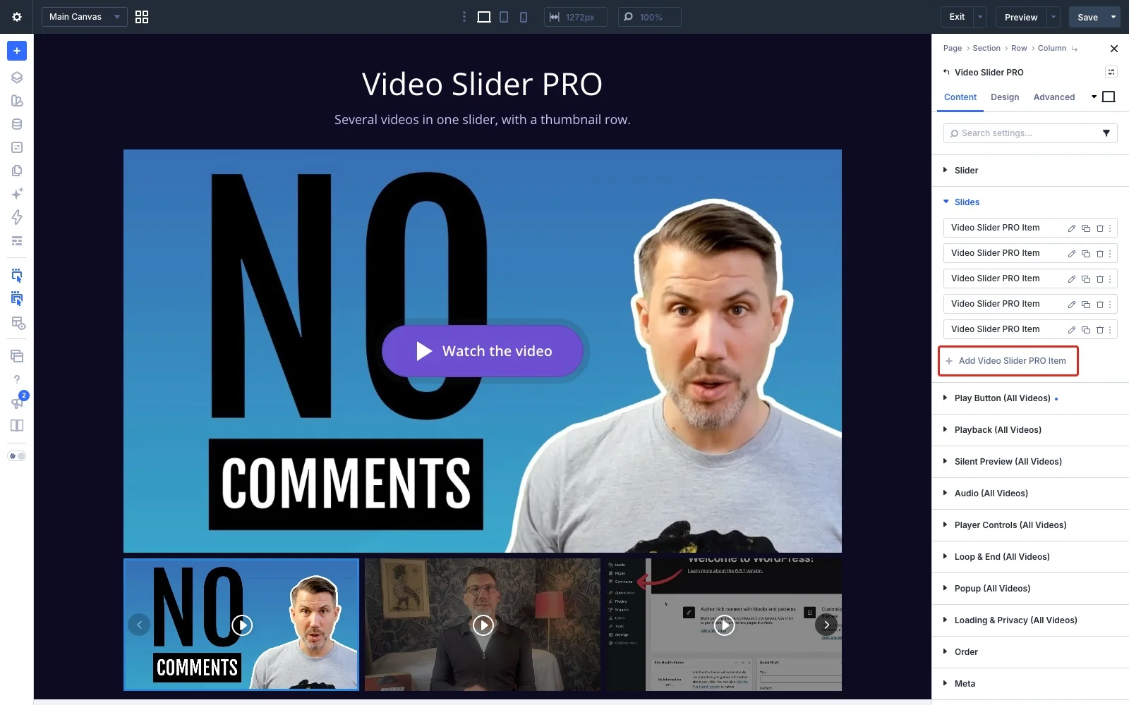
Open the slider’s settings and go to Slides. Click Add Video Slider Pro Item for each new video, and drag the slides to change their order. Click the pencil icon on a slide to edit it.
Setting up a slide
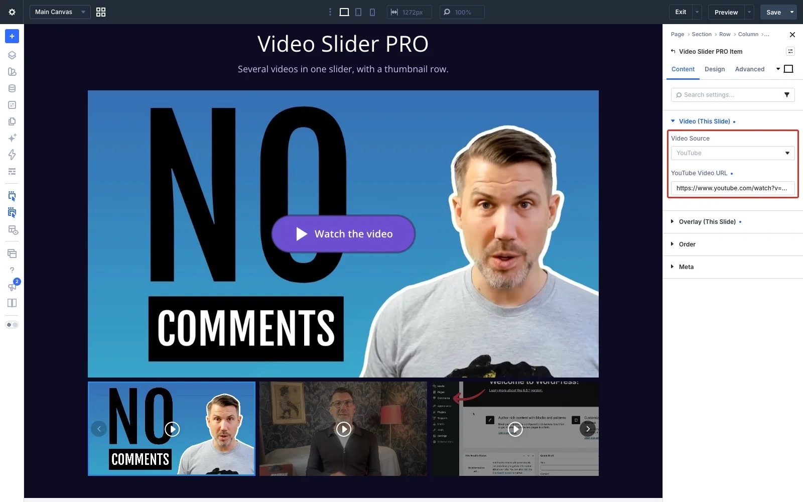
In Video (This Slide), choose the slide’s source and add the link or the file, just like in Video Pro. Each slide picks its own source, so you can mix them in one slider.
In Overlay (This Slide) you can give the slide its own image. The image covers the video until someone presses play, and it’s also the slide’s thumbnail. Generate From Video copies the video’s thumbnail into your Media Library.
No image? Then the slide shows the video itself, and its thumbnail is made from the video. The plugin saves a copy of that image in your Media Library in the background. That saved copy is also used whenever the player needs an overlay anyway: with a customized play button, a popup or Don’t Load Data Until Click. With Don’t Load Data Until Click, nothing is fetched from the video service before a click, so a slide shows a placeholder until its copy exists. Adding your own images avoids that.
A slide can also have its own play icon, under Play Button Icon (This Slide) in its Design tab.
Navigation
All of these are in the Slider group:
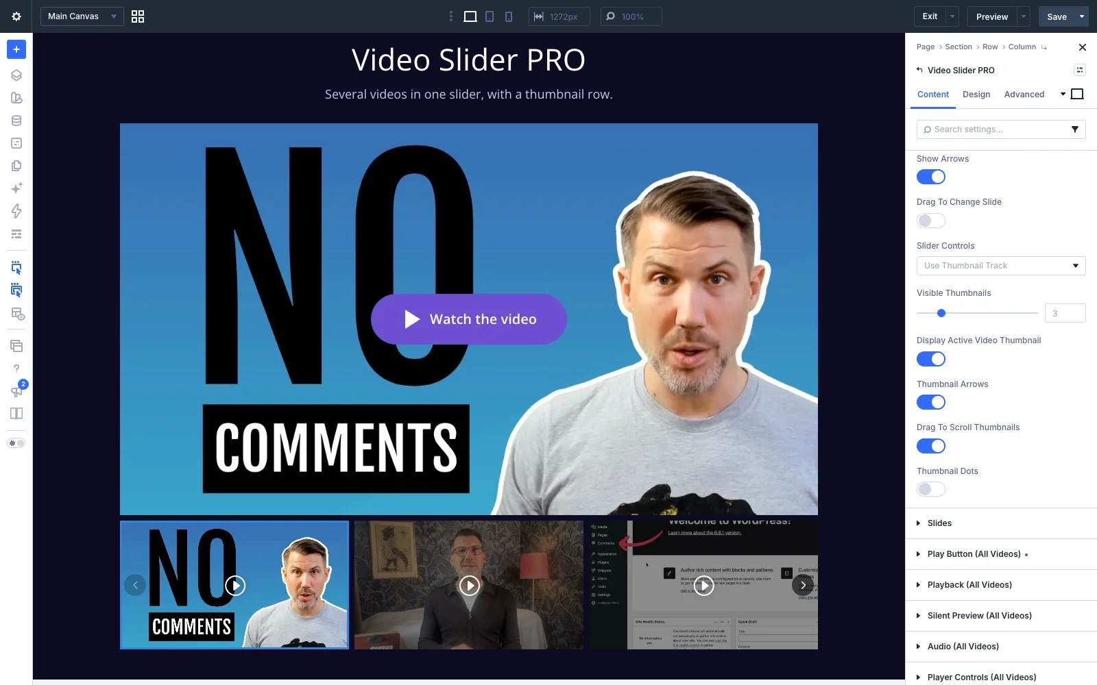
- Show Arrows puts previous and next arrows on the video. You can turn them off on phones only, for example.
- Drag To Change Slide lets visitors drag the slider with the mouse. It works on an overlay image and on a video file. An embedded player from a video service keeps the mouse for itself, so leave it off if your slides show the player directly. Swiping on phones always works.
- Slider Controls chooses between a thumbnail track, dots under the video, or no controls at all.
Visitors can also use the keyboard: with a thumbnail or dot selected, the left and right arrow keys move between videos.
The thumbnail track
With Use Thumbnail Track, a row of thumbnails sits under the video. These options appear:
- Visible Thumbnails: how many fit side by side. Set it separately for desktop, tablet and phone. The default is three.
- Display Active Video Thumbnail: on by default. Turn it off and the row only shows the videos that aren’t playing.
- Thumbnail Arrows, Drag To Scroll Thumbnails and Thumbnail Dots: how visitors move through more thumbnails than fit in one row. Use any combination. Arrows and dragging are on by default. The arrows only appear when there are more thumbnails than fit, and the dots show one dot per page of thumbnails.
On phones, the row can always be swiped.
Playing through the slides
These settings decide how the videos play one after another. They’re in two groups that apply to all videos.
In Playback (Active Video):
- Autoplay (Muted) starts the first video when the page loads. In a slider it only starts the first one.
- Autoplay On Slide Change starts a video as soon as its slide is shown. Once the visitor has clicked anywhere on the page, the next video plays with sound, unless Start Video Muted is on. If nobody has clicked yet, for example because the first video started with Autoplay (Muted), the next one stays muted too. That’s a browser rule, and it also keeps a silent page from suddenly making noise. It isn’t available with a popup or Don’t Load Data Until Click, because those videos wait for a click. With Disable Click Trigger Completely it’s always on, since nothing else could start the next videos.
In Loop & End (Active Video):
- Loop Each Video repeats the video on the current slide.
- Go To Next Slide When A Video Ends moves on to the next slide and starts it. It appears once Autoplay On Slide Change is on, since it needs to start the next video.
- Start Over After The Last Slide (on by default) goes back to the first video after the last one, so the slider keeps playing in a loop. Turn it off to stop after the last video. The last video then shows its end state, set further down in the same group.
With Loop Each Video and Go To Next Slide both on, each video repeats the set number of times before the slider moves on. Loop Infinitely isn’t available then: a video that never ends would keep the slider from moving on.
When a slide is shown again, its video starts from the beginning, not where it was left.
Videos in a popup. With Open Video In Popup on, each video opens in a popup when clicked, so the slider doesn’t move on by itself. Turn on Play Next Video In Popup (in Popup (Active Video)) to play the videos one after another in the popup instead, like a playlist. The slider follows along behind the popup, so it shows the right slide when the visitor closes it. It stops after the last video. Loop Infinitely isn’t available with it, but a set number of repeats is.
Tip: a hands-off showcase. Set Slider Controls to no controls, turn off Show Arrows, and turn on Autoplay (Muted), Autoplay On Slide Change and Go To Next Slide When A Video Ends. The slider then plays through all videos by itself, muted.
Settings for all videos
The play button, autoplay, Silent Preview, sound, player controls, popup and loading settings are the same as in Video Pro, and in the slider they apply to every slide. See the Video Pro documentation for how each one works.
The play button on the large video player is set up under Play Button (Active Video). The thumbnails have their own group, Play Button (Thumbnails), shown with the thumbnail track. With Inherit From Active Video on (the default), the thumbnails show the active video’s play icon and animation. Turn it off to give them their own icon and animation.
Styling
The slider’s own parts each have a group in the Design tab:
- Slider Arrows and Slider Dots: color, size and placement, plus background, border, spacing and shadow. Arrows can sit on the video or beside it. On phones, arrows set beside the video move onto it, so they stay on screen. Dots can sit under the video or on it.
- Play Button Icon (Active Video) and Play Button Text (Active Video): colors, size, spacing, borders and shadows of the play button on the video player.
- Play Button Icon (Thumbnails): the size, color and background of the play icon on the thumbnails.
- Thumbnail Arrows: the arrows on the thumbnail row, with their own color, size, background, border, spacing and shadow.
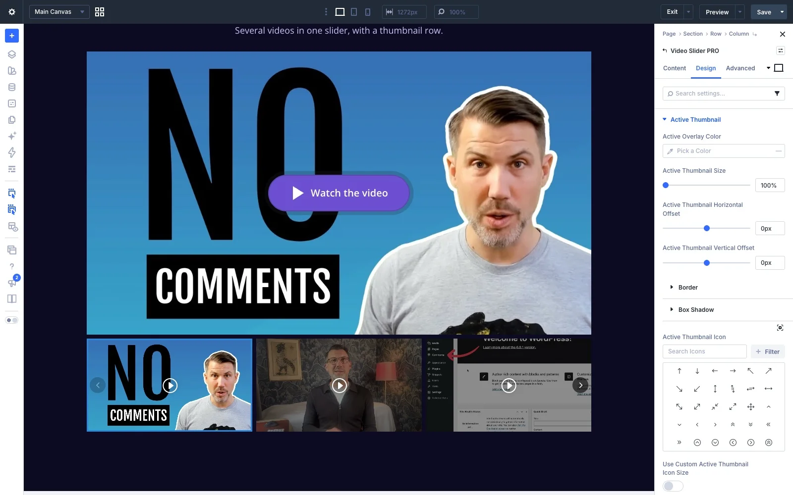
- Active Thumbnail: how the thumbnail of the playing video stands out. Give it its own overlay color, border, shadow and icon, make it up to 130% larger than the others, and move it up or to the side, for example to let it overlap its neighbor. Sideways it can even move beyond the slider, while the other thumbnails stay in place. By default it has a border in your site’s primary color.
The slider’s design settings also work with Divi’s responsive settings, so the arrows, the dots and the active thumbnail can look different on tablets and phones.
FAQ
What's the difference between the annual and the lifetime license?
Can I use Divi Video Pro on client websites?
What happens when an annual license expires?
Is there a money-back guarantee?
I usually buy on the Divi Marketplace. Should I buy there instead?
Do you add VAT?
Why doesn't autoplay start on my device?
Usually it's a setting on the device, not on your site. Browsers only allow autoplay without sound, so Divi Video Pro always starts an autoplaying video muted. Even then, the device or browser can stop it:
- iPhone and iPad block autoplay when Low Power Mode is on.
- Some phones and browsers block it when data saving or battery saving is on.
- Safari and Firefox have a setting that stops autoplay on all websites or on one site.
- If the device is set to reduce motion and Respect Reduced Motion is on in the module, autoplay is skipped on purpose.
The video then waits for a tap or click instead, so visitors can still start it. To see autoplay work, turn off Low Power Mode or try another device. If the video doesn't start on any device, check that Start Autoplay When In View or Delay Autoplay isn't making it wait, and clear your caches.
