Accessibility is an often overlooked factor when optimizing a Divi website. But a good accessibility is important if you want your website to work for all users regardless of impairments. And it’s also a factor in your Google PageSpeed results.
If you scroll down past the Performance section in your report, you’ll see your Accessibility score on a scale from 0-100 and a list of opportunities to improve the accessibility of your website. Spoiler alert! In this post, I will show you how to go from 66/100 to a perfect 100/100 using Divi with no plugins or paid services at all.
Join +5 180 subscribers!
Planning for accessibility means thinking about users who are experiencing some type of impairment or disability in one or more of these categories. Bear in mind that that experience might be non-physical or temporary—for instance, trying to read a screen outside during a bright, sunny day or operating a device one-handed while carrying a cup of coffee.
Measuring Your Accessibility Score With One Click
If you are a website owner, you have probably already analyzed your page speed score on Google PageSpeed Insights. But the report tells you a lot more than your page speed performance as you also get reports on Accessibility, Best Practices and SEO.
Is Divi Good For Accessibility?
I’ve tested a bunch of Divi websites and the Accessibility score often ranges from 60-85 out of 100. But it’s not fair to entirely blame these scores on Divi alone since much of the responsibility lies at the web creator using the tool.
For example, you need to choose high contrast colors in your design to ensure a good experience for users with low vision. And you need to add alt texts (alternative texts) to images that describes the appearance or function for visually impaired users that use screen readers.
As I will show you below, it’s pretty simple to bump your accessibility score to 100/100 using Divi.
Tutorial: Going From 66/100 to 100/100 Accessibility Score With Divi
I installed a clean Divi website without any plugins or custom code. Then I imported the free Book Club layout pack from Elegant Themes.
The Accessibility report highlights four critical areas where we can improve our score: Best practices, Contrast, Names and labels and Navigation. Let’s fix them one by one!
1. Enable zooming and scaling
The report tells me that [user-scalable=”no”] is used in the <meta name=”viewport”> element or the [maximum-scale] attribute is less than 5.
This might sound very technical and confusing but it means that zooming is disabled by default in Divi and that can be “problematic for users with low vision who rely on screen magnification to properly see the contents of a web page”. According to Deque University, it’s critical that “zooming and scaling must not be disabled” according to WCAG 2.1 Best Practice.
How to fix it
First, you need to make sure that you have an active Divi child theme. Then, add this snippet to the functions.php file in your child theme:
function remove_my_action() {
  remove_action('wp_head', 'et_add_viewport_meta');
}
function dt_et_add_viewport_meta(){
  echo '<meta name="viewport" content="width=device-width, initial-scale=1.0, maximum-scale=5.0, user-scalable=1, viewport-fit=cover" />';
}
add_action( 'init', 'remove_my_action');
add_action( 'wp_head', 'dt_et_add_viewport_meta' );The result: From 66/100 to 85/100
Woop woop! We climbed 19 points from 66 to 85 with this single action. Let’s climb some more.
2. Improving the colors contrast ratio
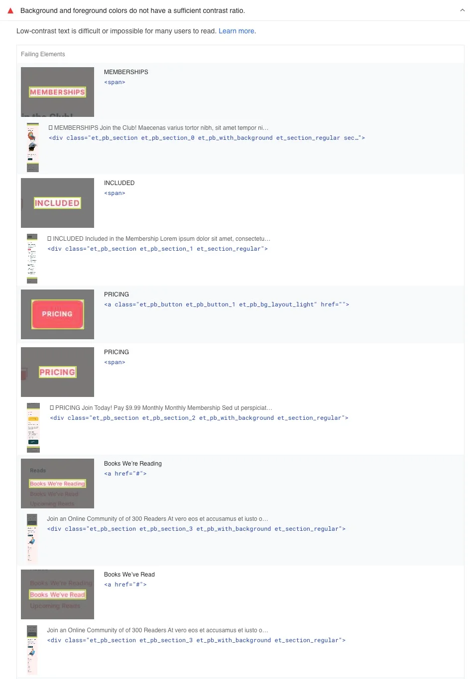
The second critical accessibility problem reads: Background and foreground colors do not have a sufficient contrast ratio. Furthermore, it says: Low-contrast text is difficult or impossible for many users to read.
Well, this is pretty straight forward: Don’t use light text on light background or dark text on dark backgrounds.
If you expand the result tab, you will get a list of failing elements:

How to fix it
We need to change the pink-red color #ff5d67 to a color that has better visibility on light backgrounds.
I’ll head over to the Color Contrast Analyzer from Deque University and enter the foreground color #ff5d67 and the background color #f2f2f2. The result is an epic WCAG Standard AA and AAA fail for all sizes.
I’ll use the handle to reduce the foreground color lightness until I pass the test AA test for small text and large objects. The result is the color #e0000f.
The result: From 85/100 to 91/100
Oh yes, we have finally entered the green zone with a well deserved additional 6 points. But why settle for good when we can go for perfect?
3. Adding discernible names to links
The third accessibility issue is: Links do not have a discernible name. The report tells us that “link text (and alternate text for images, when used as links) that is discernible, unique, and focusable improves the navigation experience for screen reader users”. That makes sense, right?
In this case, the logo in my main menu doesn’t have an alt text. This means that blind or visually impaired users will not be able to understand the meaning of the image if they use screen readers. Alt texts are also an important factor for SEO. Let’s fix that!
How to fix it
I’ll head over to my WordPress Media Library and I’ll click the my logo image. Now I can add a descriptive Alternative Text (alt text). In this case, I’ll use the site name VictorDuse.com as alt text. Just close the popup to save.
💡 Pro tip: Images that are purely decorative should just have an empty alt text (so that they can be ignored by screen readers). Background images will not display any alt text since they are displayed with CSS and not HTML.
The result: From 91/100 to 96/100
We’re getting closer to the top with an extra 5 accessibility points. The finish line is within sight!
4. Organizing heading elements in order
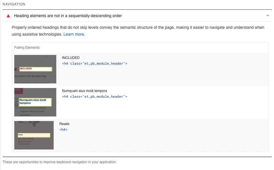
The last accessibility issue is about navigation and it says: Heading elements are not in a sequentially-descending order. The in-depth description says: “Properly ordered headings that do not skip levels convey the semantic structure of the page, making it easier to navigate and understand when using assistive technologies”.

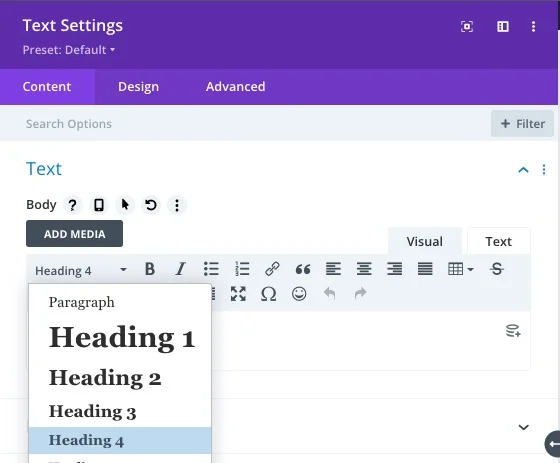
💡 Pro tip: Ask yourself: Is this really is a heading? Would you you use it in a table of contents section? If not, it should probably be wrapped as regular text in a paragraph instead. You can still style it the text like a heading, but from an accessibility perspective, heading tags should only be used for headings that are meaningful. Keep in mind that HTML (for example H1-H6 tags) should provide structure while CSS (font size, font weight and color) is all about the visual design.
How to fix it
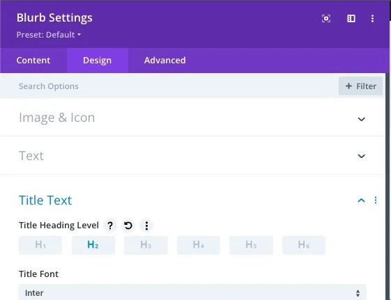
In this case, the Divi Blurb module is an issue since it uses H4 headings by default. To change this, I simply open the settings for the Blurb modules and I go to Design » Title Text » Title Heading Level and I choose a more suitable heading level, for example H2 or H3.


The result: From 96/100 to 100/100 🥳
We did it! The last 4 points gained us a perfect accessibility score. Let’s celebrate! And then let’s talk about why this still isn’t good enough.
Next Step: Being WCAG2 Compliant
Even though a perfect accessibility score from Google might be good enough for many website owners, there are exceptions. There are sectors and countries where your site has to be WCAG2 (Web Content Accessibility Guidelines version 2) compliant by law.
To achieve this with Divi (or any WordPress theme) can be complicated and often demands lots of custom coding. But hey, do not despair! There is a more convenient solution.
Divi Assistant – the ultimate plugin to make Divi Accessible for all
The brand new flag ship plugin Divi Assistant from Pee-Aye Creative is here. It will change the way you build WordPress sites by ironing out the kinks in both WordPress and Divi – and adding dozens of new killer features. Divi Assistant helps you make your website WCAG2 compliant by adding a long list of accessibility options in the Divi Theme Options. Why code when you can flip a switch?
Divi Assistant Pricing
Divi Assistant is available from $79 per year (lifetime license is also available).
The links to Divi Assistant are affiliate links. That means that I will get a commission if you purchase something but it will never cost more for you. Thanks for your support!
Divi Assistant Accessibility Features
Here’s the list of features provided by the plugin developer.
Add Focusable Support To Divi Module elements
The term “focusable” in website accessibility refers to elements on a webpage that can be selected using the keyboard’s “Tab” key. This is crucial for enabling users to interact with and navigate through different interactive elements on a webpage, and aligns with Web Content Accessibility Guidelines (WCAG) to create more inclusive web content. Enabling this setting will add support for focusable elements in Divi modules, enabling them to be navigated with the keyboard. Currently, this feature applies to both the Toggle module and Accordion module. Pressing the enter key will either expand or collapse the toggles when they are in focus.
Add Keyboard Navigation Outline To Focused elements
A focused elements outline refers to a visible indication or highlighting applied to an element on a webpage when it receives keyboard focus. When a user interacts with a webpage using their keyboard, navigating through different interactive elements using the “Tab” key, the currently focused element should be visually distinguishable from other elements. This practice is fundamental for web accessibility, ensuring that users with disabilities, particularly those who rely on keyboard navigation or screen readers, can accurately track their position within the interface. Enabling this setting will add a keyboard navigation outline to focused elements.
Add ARIA Support To Divi Module Elements
ARIA (Accessible Rich Internet Applications) support involves adding attributes to HTML elements to improve web accessibility for people with disabilities. These attributes provide extra information to assistive technologies like screen readers to help convey interactive element behavior. ARIA attributes supplement standard HTML when elements don’t fully describe their functionality. By ensuring your site has proper ARIA support, you can improve the accessibility of your website to ensure users with disabilities can effectively navigate and interact with the content, features, and functionality. Enabling this setting will add appropriate ARIA attributes across various Divi elements and modules.
Set Icons as ARIA Hidden
Setting icons as ARIA hidden to indicate that certain icons within a web page should be hidden from assistive technologies, such as screen readers. This attribute is particularly useful when icons are used for purely decorative purposes and don’t convey meaningful information to users relying on assistive technologies. This helps create a more accessible web experience for users with disabilities while still maintaining the intended design aesthetics. Enabling this setting adds the “aria-hidden” attribute to icons.
Underline All Links
Underlining links in web accessibility refers to using underlines to visually differentiate and highlight hyperlinks from regular text within web content. This is important for creating a more inclusive and user-friendly experience for individuals with disabilities, particularly those who rely on assistive technologies like screen readers to navigate and understand web pages. Underlining links serves as a clear and consistent indicator to users that certain text or elements are interactive and lead to another page or resource when clicked. This is especially valuable for users who have visual impairments or color blindness, as they might have difficulty distinguishing links solely based on color or other visual cues. Enabling this setting will add an underline to all links within the website content.
Add Skip Navigation Link Option
A skip navigation link is a crucial accessibility feature in web design that allow users to bypass repetitive content, such as navigation menus, and quickly jump to the main content of a webpage. These links are particularly useful for keyboard users and assistive technology users, as they help them efficiently navigate through web pages without having to tab through every menu item. Enabling this setting will add the option for users to skip over the Divi navigation menu links when using keyboard navigation and go straight to the main content area
Fix Duplicate Menu IDs
Due to Divi’s usage of the same menu for both the primary and mobile menus, a situation arises where unique IDs are duplicated, leading to validation problems. Duplicated IDs are problematic for web accessibility primarily because they violate the fundamental rule that HTML IDs must be unique within a web page. When IDs are duplicated, it can lead to a range of accessibility issues that hinder users, particularly those who rely on assistive technologies like screen readers, from navigating and understanding the content effectively. Enabling this setting prevents WordPress from automatically assigning unique IDs to the menu items.
Enable Dropdown Menu Keyboard Navigation
By default, Divi dropdown menus might not open or be easily navigable using the keyboard. This provides a very poor experience for users who rely on keyboard navigation to effectively interact with and navigate through the dropdown menus. Keyboard navigation support for Divi dropdown menus enhances the accessibility and usability of the menus and aligns with web accessibility guidelines and promotes a more inclusive web experience for all users. Enabling this feature enables the Divi Menu dropdown menus to open and be easily navigated using the keyboard.
Add And Improve Screen Reader Classes
A screen reader class is a specific CSS class that is used to improve the accessibility of web content, particularly for users who rely on screen readers for browsing. These classes are often added to elements like labels within a webpage to enhance the way these elements are presented and interpreted by screen readers, making them more comprehensible and informative for individuals with visual impairments. Unfortunately, the Divi theme’s built-in screen reader classes sometimes use the display: none; property, which hides elements from the visual display. This can create accessibility challenges. Our goal is to identify and address these instances and ensure your website content is properly exposed to screen readers. Enabling this setting will add the screen reader class to various labels throughout Divi and reverse the incorrectly applied display: none; property.
Enable Browser Pinch And Zoom
By default, Divi disables the ability to pinch and zoom on mobile. However, browser zoom plays a significant role in web accessibility by ensuring that digital content is usable and legible for a wide range of users, including users with visual impairments, low vision, or other disabilities who may rely on browser zoom to make content more readable. Enabling this setting will enable the ability to pinch and zoom the screen on mobile devices.
Add Tota11y Button
A tota11y button refers to a link used to open the tota11y accessibility tool, which is a JavaScript toolkit used by web developers and designers to identify and address accessibility issues on websites. The tool allows you to activate visual overlays that highlight potential accessibility problems, which can help improve your websites’ accessibility. However, while tota11y is useful for identifying issues, it should be used in conjunction with other accessibility best practices for a comprehensive approach. Enabling this setting adds the tota11y button to the bottom left corner of your website.
That’s all for today!
I hope that you enjoyed this post. Subscribe to VictorDuse.com on YouTube and join our Facebook group for more crisp content on WordPress and web design.
👉 Related post: Why I Removed Google reCAPTCHA v3 (And Why You Probably Should Too)
👉 Free course: Create a website from scratch with Divi


Hi, just a note that this blog’s price quoted for a lifetime licence is incorrect. you have it at $24.99 and it is $129.99 for the lifetime.
Thanks Raymond! I’ve updated the pricing now so everything should be correct.
Excellent article! Fixed almost every issue. Thank you! One last issue I can’t figure out: Social Media icons in the Divi footer are also throwing the “Links do not have a discernible name. ” error. Icons aren’t as easily fixed as the logo image in #3. Any tips? Thanks!
Thanks Kathy! You could probably fix it by injecting an aria-label to the A tag using JavaScript (or using the plugin Divi Accessibility Helper). I don’t have a solution up my sleeve at the moment but I’m planning to do a follow up tutorial with a fix for this and some other more complex cases.
Is this plugin still being updated? It looks like it hasn’t been updated in 6 months.
Hi Dave! My best guess is that there is a lot of focus on converting third party plugins to work with the new Divi 5 foundation. But I’ve asked the plugin developer to answer your question.
Enable zooming and scaling dosen’t work for me. Any ideas?
It’s the official code from Elegant Themes so it should work. Have you tried clearing your website and browser cache?
In the source code, the line is indicated. But Page Speed Insight still complains.
Hi again Michél! It seems like my code syntax plugin converted the ” characters after an update. That was probably the reason why it didn’t work. I’ve updated the post now.